Whether it’s black metal aesthetics masking ska punk or sunshine visuals hiding sonic chaos, these records challenge everything we expect from album artwork.
Album artwork is often seen as the visual representation of an artist’s music and can be integral to their visual identity, but sometimes the visual of the cover does not seem to quite match the music. In the days before the internet and social media dominated the landscape with readily available media to consume, the only way to tell if you liked an artist was to buy their album and hope and pray you liked it and it was the right purchase to make.
One distinctive way was the album artwork, does it have grotesque imagery akin to Cannibal Corpse? It’s probably a heavy metal record. Are the members of the group posing together possibly crouched down? It’s a rap record. Colourful, smiling and crisp clean lettering like Cascada, perfect for a eurodance record. But what about the albums that go against the grain and surprise the listener with something that they were not expecting.
Throbbing Gristle – 20 Jazz Funk Greats
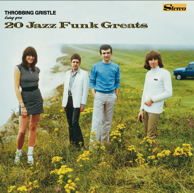
Starting with 20 Jazz Funk Greats by Throbbing Gristle (1979). This album has 11 tracks that are neither jazz or funk which is a little confusing, combined with the cover that looks like it could belong to a Beach Boys record. The cover image itself was taken at Beachy Head on the Sussex coast, a place that has been featured in various media throughout the years including Chitty Chitty Bang Bang (1968 film), Quadrophenia (1979 film), Harry Potter and the Goblet of Fire (2005 film) as well as used as the location for music videos by David Bowie and The Cure.
But Beachy Head is most prominently known for being one of the most popular suicide spots in the world. In a 2012 interview, member of Throbbing Gristle, Cosey Fanni Tutti said: ‘We did the cover so it was a pastiche of something you would find in a Woolworth’s bargain bin. We took the photograph at the most famous suicide spot in the world. So, the picture is not what it seems, it is not so nicey nicey at all, and neither is the music once you take it home and buy it.
“We had this idea in mind that someone quite innocently would come along to a record store and see the record and think they would be getting 20 really good jazz/funk greats, and then they would put it on at home and they would just get decimated.”
Rolo Tomassi – Cosmology
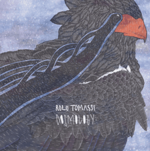
Next take the 2010 album Cosmology by British post-metal band Rolo Tomassi and was produced by American DJ Diplo. This album’s artwork is very reminiscent of 2010’s indie bands, a far cry from their mathcore second album. Created by Simon Moody, a long-serving artist for the band. Moody uses geometric shapes integrated with hand-drawn imagery, detailed linework, textured patterns that resemble feathers, giving the piece a layered, almost etched appearance.
Blackgaze genre

Blackgaze artists also have an affinity for covers that don’t really fit. Blackgaze are a new school of bands taking black metal out of the shadows and melding its blast beats, dungeon wailing and razorwire guitars with the more reflective melodies of post-rock, shoegaze and post-hardcore.
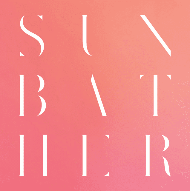
The first prime example is Deafheaven, their releases Sunbather (2013) and Lonely People with Power (2025) both of these covers deviate from the usual black and grey covers that are associated with blackgaze. While Sunbather is a very minimalistic bright cover, the cover of Lonely People with Power is actually a still from the music video for ‘I’m a Hustla’ by the American rapper Cassidy further breaking the blackgaze mould.
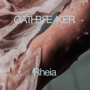
Belgian photographer Jeroen Mylle captured the cover for Oathbreaker’s 2016 release Rheia, the cover features the hands of band members Caro Tanghe and Gilles Demolder joined together. The ethereal effect was created using burning candle wax reacting to cold water.
Benson Boone – American Heart
Shirtless, abs, mullet, moustache and an American flag all present and accounted for on the cover of Benson Boone’s 2025 release American Heart. While the visuals lean into a retro-Americana patriotic aesthetic the similarities end at the cover, this upbeat cheesy pop album does a great job of making you think you have a 70’s/80’s arena rock record full of ballads, big anthems and singalongs of which there are none on this record. It’s a pop record with the aesthetic of something much different.
Bee Gees – Cucumber Castle
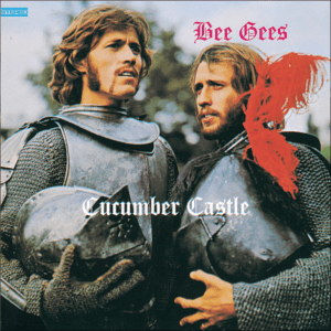
The cover from this Bee Gees album comes from a still from a BBC movie also called Cucumber Castle that starred Barry and Maurice Gibb. Robin Gibb had recently quit the band for a solo career but that still doesn’t take away from the absurdity of this cover. Clad in medieval armor and red plumes it feels as though they would be more comfortable on a medieval or power metal cover. The Gibbs went through multiple fashion phases and this one doesn’t disappoint, is it an accurate representation of the album? Absolutely not.
Crosby, Stills and Nash – Live It Up
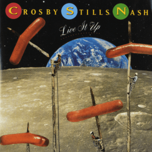
Live It Up, the sixth studio album by Crosby, Stills and Nash has quite a strange cover to say the least. The artwork originally called ‘Dogs in Space’ created by artist David Peters, started life as a bumper graphic for the TV show ‘Friday’s’, a late night comedy show airing on ABC. Ten years later, art director Jimmy Wachtel saw it and wanted to use it for this album, with a little redo it became the art you see here. The illustration won a Silver Medal in the Society of Illustrators Los Angeles, 1994 annual competition and it is very much in line with David Peters style. But what does this record have to do with trees skewering hotdogs on the moon being cut down by lumberjacks?
Roger Daltrey – Ride a Rock Horse
The second studio album by legendary The Who singer Roger Daltrey, released in 1975 depicts Daltrey as an exuberant centaur. The cover art was photographed and designed by Daltrey’s cousin Graham Huges. The record itself is a great reflection of Daltrey’s disillusionment with The Who in the mid-seventies and how he distanced himself from the band’s heavy sound, focusing more on his film career and more or less singing whatever music was put in front of him. While Daltrey is a phenomenal singer, an angelic mythical creature he is not.
Choking Victim – No Gods / No Managers
Released in 1999, the only and final studio album by Choking Victim. This cover gives off black metal vibes but an expectant black metal enthusiast would be severely disappointed. Artist Eric Drooker has also worked with the likes of Faith No More and Rage Against The Machine, uses distinct black and white scratchboard/woodcut-inspired graphic style to deeply mirror the raw, socio-political, and anti-authoritarian ethos of the Lower East Side squatter punk movement of the 1990s. The artwork uniquely juxtaposes stark, ominous religious iconography with political commentary. It prominently depicts a grim, stylized depiction of Mary and Jesus framed by columns of tiny skulls and pitchforks. While some of the lyrical content is dark this is a ska punk record.
Discordance Axis – The Inalienable Dreamless

Released on May 23, 2000 The Inalienable Dreamless by Discordance Axis presents itself with a serene relaxing cover, more associated with either an electronic or clam instrumental record. The image was taken by Scott Kinkade at Sea Bright in New Jersey, this cover is famously deceptive as it contrasts sharply with the intense technical grindcore found within the album. RW
Featured image via Throbbing Gristle, Deafhaven, Bee Gees and Cosby, Stills and Nash on Spotify

0 Comments